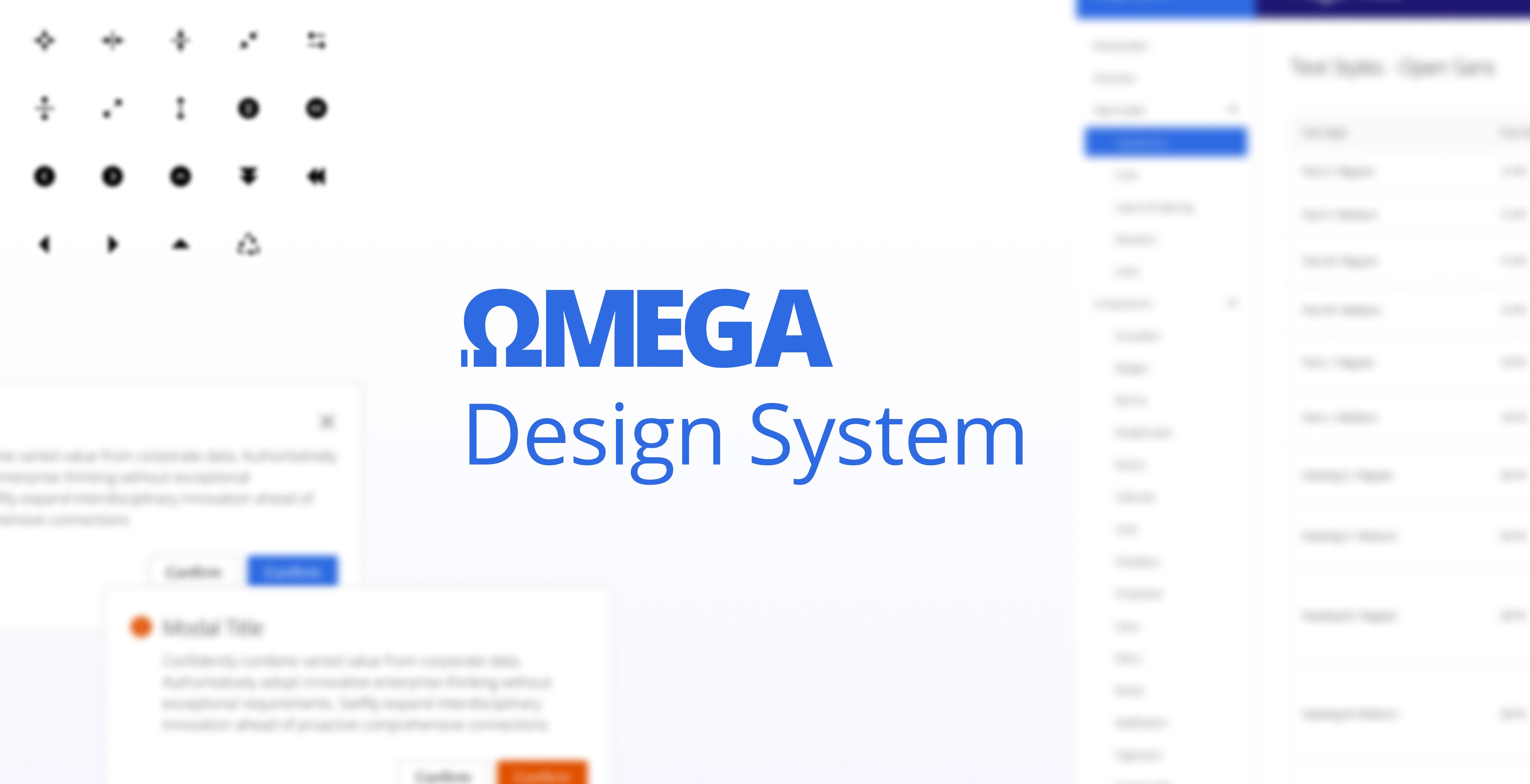
Omega Design System
In today's digital landscape, the demand for cohesive and adaptable design systems for both web and mobile applications is ever-growing. This case study delves into the creation of a multipurpose design system that seamlessly caters to the needs of modern app development. As the sole designer on this project, I was tasked with overcoming various challenges to meet specific goals and deliver an efficient, flexible design system.
Anywhere
Design System
Challenge
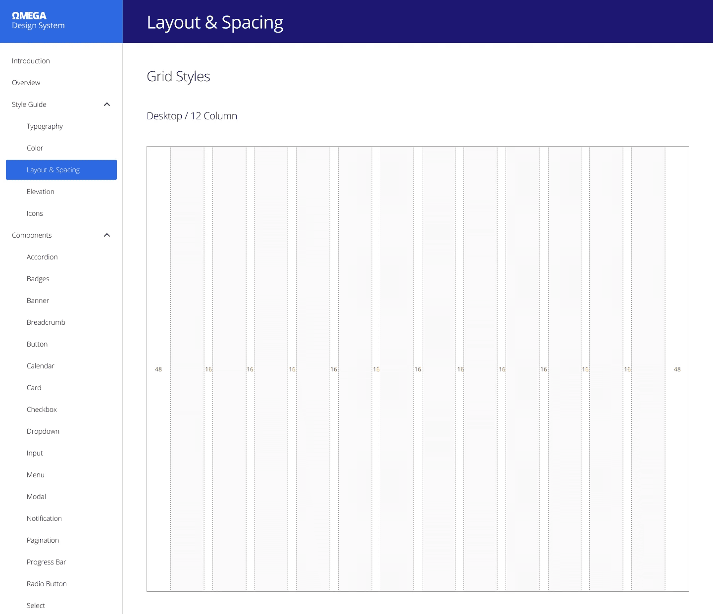
The challenge was to develop a design system that could be effortlessly applied to web and mobile applications across different platforms, maintaining a consistent user experience while allowing for platform-specific nuances. The design system needed to address issues such as responsive design, accessibility, and scalability.
Goals
Versatility: Create a design system that can be used across various platforms, including web and mobile, while accommodating differences in screen size, interactions, and user contexts.
Consistency: Ensure a uniform visual and interactive experience throughout all applications, adhering to established branding guidelines.
Scalability: Design components and patterns that can evolve and scale with future app requirements, minimizing the need for extensive redesigns.
85%
Documentation
100%
Adaptability
Process
Research and Discovery
Conducted extensive user research to understand the target audience.
Analyzed and industry leaders to identify design trends and best practices.
Information Architecture
Created a hierarchical structure for the design system, categorizing components and patterns based on their functions.
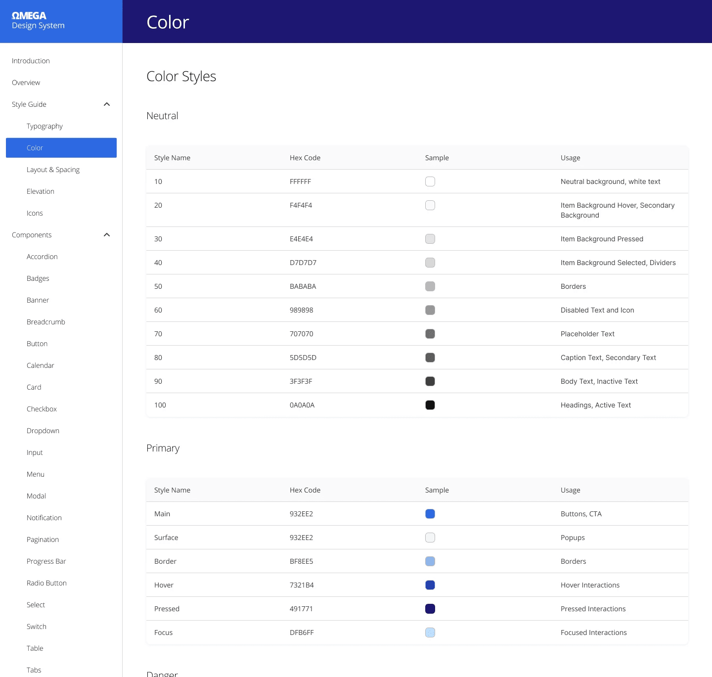
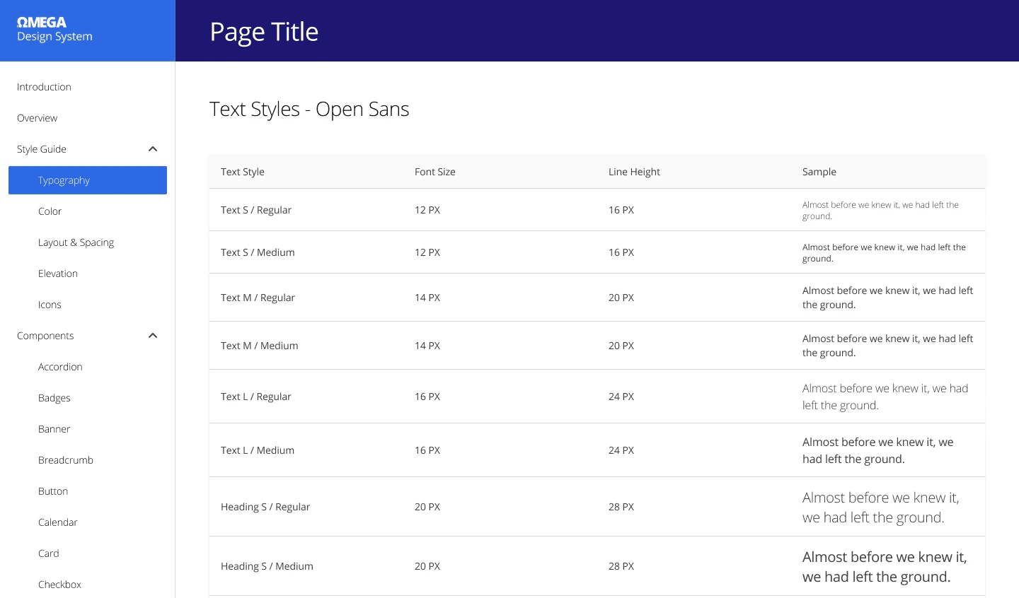
Established a naming convention and documentation standards for clarity and consistency.
Design and Prototyping
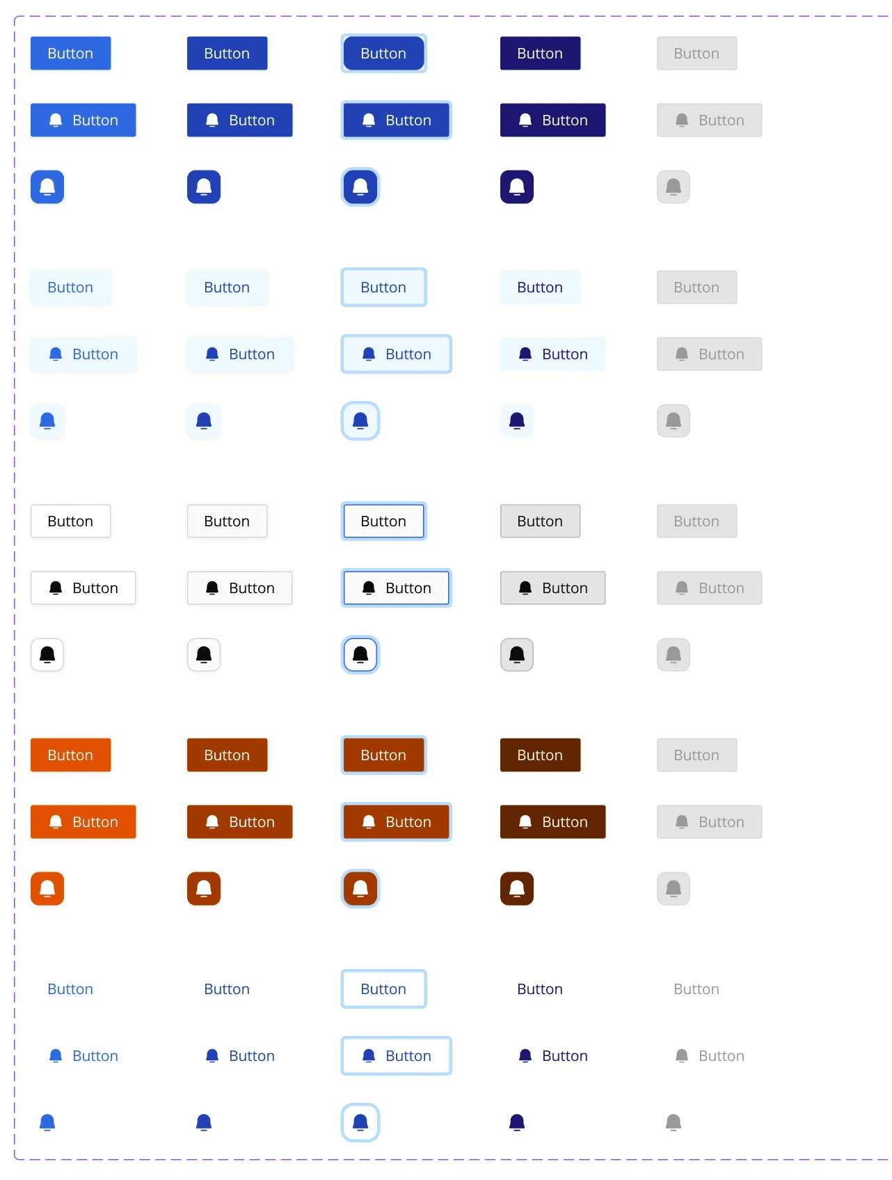
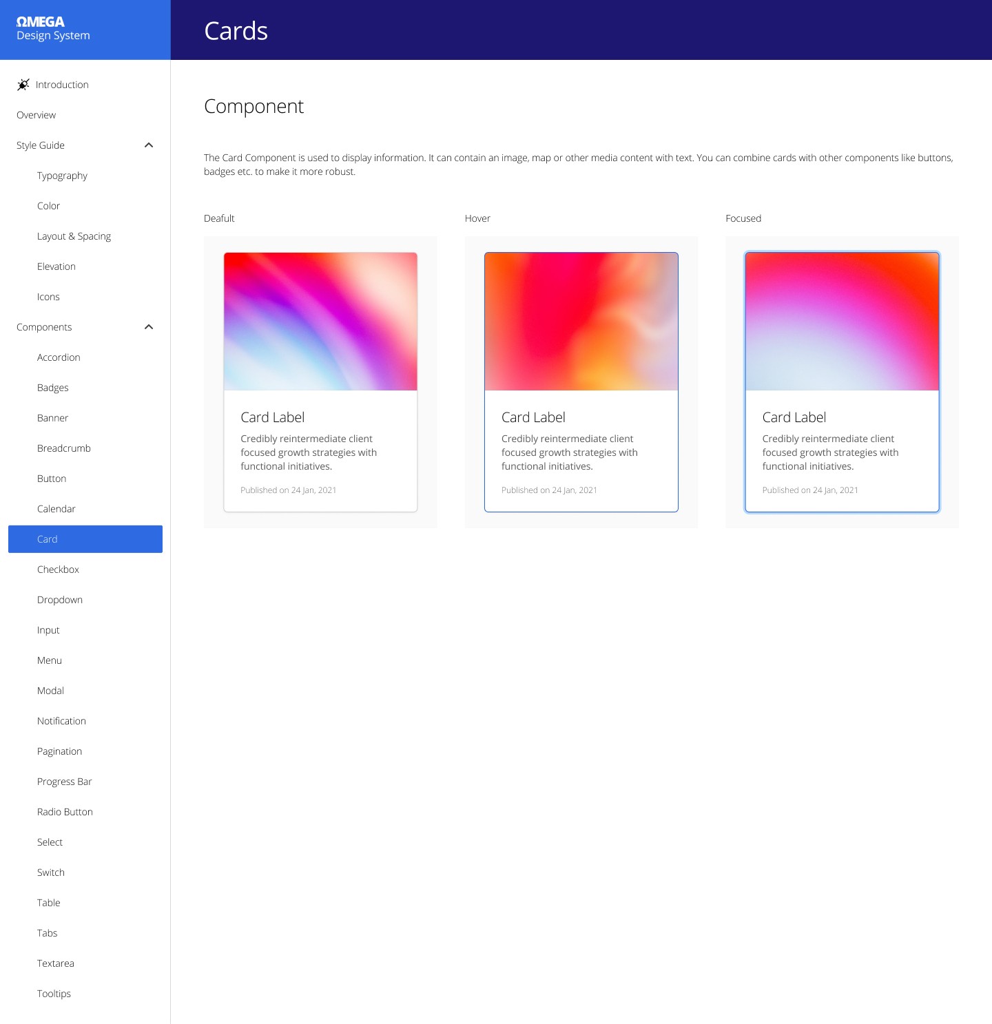
Designed a comprehensive set of UI components, including buttons, forms, navigation elements, and more, adhering to a modular approach.
Accessibility
Ensured the design system complied with accessibility standards.
Conducted accessibility audits and incorporated feedback from usability testing.
Conclusion
The journey to create this multipurpose design system was tough but totally worth it. We stuck to our user-centered approach and kept our eyes on versatility, consistency, and scalability. The result? A handy tool for designers and developers, making it easy to whip up web and mobile apps that feel smooth and connected. This project drives home the point that a well-crafted design system is gold in today's app-making world, where being adaptable and efficient is key.
Here you can find the final figma project: https://t.ly/6DAry